14:13
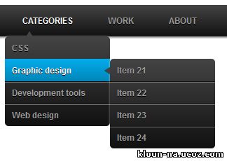
Это темной меню красивое и в нем используется минимум кода.
Установка:
html- код нашего меню:
Code
<ul id="menu">
<li><a href="#">Home</a></li>
<li>
<a href="#">Categories</a>
<ul>
<li><a href="#">CSS</a></li>
<li><a href="#">Graphic design</a></li>
<li><a href="#">Development tools</a></li>
<li><a href="#">Web design</a></li>
</ul>
</li>
<li><a href="#">Work</a></li>
<li><a href="#">About</a></li>
<li><a href="#">Contact</a></li>
</ul>
Этот код ставим после body на всех нужных страницах:
Code
/* Main menu */
#menu
{
width: 100%;
margin: 0;
padding: 10px 0 0 0;
list-style: none;
background: #111;
background: -moz-linear-gradient(#444, #111);
background: -webkit-gradient(linear,left bottom,left top,color-stop(0, #111),color-stop(1, #444));
background: -webkit-linear-gradient(#444, #111);
background: -o-linear-gradient(#444, #111);
background: -ms-linear-gradient(#444, #111);
background: linear-gradient(#444, #111);
-moz-border-radius: 50px;
border-radius: 50px;
-moz-box-shadow: 0 2px 1px #9c9c9c;
-webkit-box-shadow: 0 2px 1px #9c9c9c;
box-shadow: 0 2px 1px #9c9c9c;
}
#menu li
{
float: left;
padding: 0 0 10px 0;
position: relative;
line-height: 0;
}
#menu a
{
float: left;
height: 25px;
padding: 0 25px;
color: #999;
text-transform: uppercase;
font: bold 12px/25px Arial, Helvetica;
text-decoration: none;
text-shadow: 0 1px 0 #000;
}
#menu li:hover > a
{
color: #fafafa;
}
*html #menu li a:hover /* IE6 */
{
color: #fafafa;
}
#menu li:hover > ul
{
display: block;
}
/* Sub-menu */
#menu ul
{
list-style: none;
margin: 0;
padding: 0;
display: none;
position: absolute;
top: 35px;
left: 0;
z-index: 99999;
background: #444;
background: -moz-linear-gradient(#444, #111);
background: -webkit-gradient(linear,left bottom,left top,color-stop(0, #111),color-stop(1, #444));
background: -webkit-linear-gradient(#444, #111);
background: -o-linear-gradient(#444, #111);
background: -ms-linear-gradient(#444, #111);
background: linear-gradient(#444, #111);
-moz-box-shadow: 0 0 2px rgba(255,255,255,.5);
-webkit-box-shadow: 0 0 2px rgba(255,255,255,.5);
box-shadow: 0 0 2px rgba(255,255,255,.5);
-moz-border-radius: 5px;
border-radius: 5px;
}
#menu ul ul
{
top: 0;
left: 150px;
}
#menu ul li
{
float: none;
margin: 0;
padding: 0;
display: block;
-moz-box-shadow: 0 1px 0 #111111, 0 2px 0 #777777;
-webkit-box-shadow: 0 1px 0 #111111, 0 2px 0 #777777;
box-shadow: 0 1px 0 #111111, 0 2px 0 #777777;
}
#menu ul li:last-child
{
-moz-box-shadow: none;
-webkit-box-shadow: none;
box-shadow: none;
}
#menu ul a
{
padding: 10px;
height: 10px;
width: 130px;
height: auto;
line-height: 1;
display: block;
white-space: nowrap;
float: none;
text-transform: none;
}
*html #menu ul a /* IE6 */
{
height: 10px;
}
*:first-child+html #menu ul a /* IE7 */
{
height: 10px;
}
#menu ul a:hover
{
background: #0186ba;
background: -moz-linear-gradient(#04acec, #0186ba);
background: -webkit-gradient(linear, left top, left bottom, from(#04acec), to(#0186ba));
background: -webkit-linear-gradient(#04acec, #0186ba);
background: -o-linear-gradient(#04acec, #0186ba);
background: -ms-linear-gradient(#04acec, #0186ba);
background: linear-gradient(#04acec, #0186ba);
}
#menu ul li:first-child > a
{
-moz-border-radius: 5px 5px 0 0;
border-radius: 5px 5px 0 0;
}
#menu ul li:first-child > a:after
{
content: '';
position: absolute;
left: 30px;
top: -8px;
width: 0;
height: 0;
border-left: 5px solid transparent;
border-right: 5px solid transparent;
border-bottom: 8px solid #444;
}
#menu ul ul li:first-child a:after
{
left: -8px;
top: 12px;
width: 0;
height: 0;
border-left: 0;
border-bottom: 5px solid transparent;
border-top: 5px solid transparent;
border-right: 8px solid #444;
}
#menu ul li:first-child a:hover:after
{
border-bottom-color: #04acec;
}
#menu ul ul li:first-child a:hover:after
{
border-right-color: #04acec;
border-bottom-color: transparent;
}
#menu ul li:last-child > a
{
-moz-border-radius: 0 0 5px 5px;
border-radius: 0 0 5px 5px;
}
/* Clear floated elements */
#menu:after
{
visibility: hidden;
display: block;
font-size: 0;
content: " ";
clear: both;
height: 0;
}
* html #menu { zoom: 1; } /* IE6 */
*:first-child+html #menu { zoom: 1; } /* IE7 */
</style>
