10:51
Сегодня вашему вниманию предоставляется , новый и модернизированный блок цитат. В этих блоках использовались различные текстуры , циклы и псевдо-классы.
Разметки
Разметка для цитат выглядит так:
Code
<div class="mb-wrap mb-style-1">
<div class="mb-thumb"></div>
<blockquote cite="http://www.gutenberg.org/ebooks/1257">
<p>Never fear quarrels, but seek hazardous adventures.</p>
</blockquote>
<div class="mb-attribution">
<p class="mb-author">Alexandre Dumas</p>
<cite><a href="http://www.gutenberg.org/ebooks/1257">The Three Musketeers</a></cite>
</div>
</div>
CSS
Code
@font-face {
font-family: 'icons';
src: url("font/icons.eot");
src:
url("font/icons.eot?#iefix") format('embedded-opentype'),
url("font/icons.woff") format('woff'),
url("font/icons.ttf") format('truetype'),
url("font/icons.svg#icons") format('svg');
font-weight: normal;
font-style: normal;
}
/* Let's set and reset some common styles */
.mb-wrap {
width: 300px;
margin: 20px auto;
padding: 20px;
position: relative;
}
.mb-wrap p{
margin: 0;
padding: 0;
}
.mb-wrap blockquote {
margin: 0;
padding: 0;
position: relative;
}
.mb-wrap cite {
font-style: normal;
}
Мы добавляем значок шрифта, который мы будем использовать в примерах. Мы также установим некоторые стили для оболочки цитат и внутренних элементов. Обратите внимание, что некоторые стили установлены по умолчанию для некоторых элементов, поэтому мы хотим их сбросить.
Пример 1
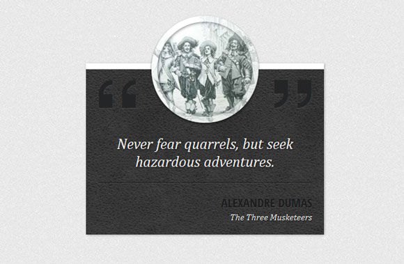
Первый пример будет иметь фон кожи и эскизы вокруг для украшения. Итак, в первую очередь стиль всей оболочки. Мы дадим ему текстуру фона и переопределим ширин:
Code
.mb-style-1 {
background: #363738 url(../images/dark_leather.jpg) repeat top left;
margin-top: 100px;
padding-top: 100px;
width: 400px;
color: #fff;
box-shadow: 1px 1px 3px rgba(0,0,0,0.3);
border-top: 10px solid #fff;
}
Круглый эскиз будет появляться с помощью отрицательного верхнего значения. С полупрозрачными границами, мы добавим некую изюминку
 :
: Code
.mb-style-1 .mb-thumb {
display: block;
width: 180px;
height: 180px;
border: 10px solid rgba(255,255,255,0.5);
border-radius: 50%;
background: url(../images/Dartagnan-musketeers.jpg) no-repeat center center;
position: absolute;
left: 50%;
top: -90px;
margin: 0 0 0 -90px;
box-shadow:
inset 1px 1px 4px rgba(0,0,0,0.5),
0 2px 3px rgba(0,0,0,0.6);
}
Для добавления кавычки, мы будем использовать значок шрифта, который мы включили раньше и псевдо-классы :before , :after.Будет установлен темный цвет с легкой тенью текста.
Code
.mb-style-1 blockquote:before,
.mb-style-1 blockquote:after {
font-family: 'icons';
position: absolute;
font-size: 70px;
top: -95px;
color: #242526;
text-shadow: 0 1px 1px rgba(255,255,255,0.1);
}
.mb-style-1 blockquote:before{
content: '\275d';
}
.mb-style-1 blockquote:after{
right: 0px;
content: '\e800';
}
Стили для текстовых элементов будут выглядеть следующим образом:
Code
.mb-style-1 blockquote p {
font-family: Cambria, Georgia, serif;
font-style: italic;
font-size: 25px;
border-bottom: 1px solid rgba(0,0,0,0.5);
box-shadow: 0 1px 0 rgba(255,255,255,0.1);
padding: 10px 10px 20px 10px;
text-align: center;
margin: 0 0 20px 0;
text-shadow: 1px 1px 2px rgba(0,0,0,0.6);
}
.mb-style-1 .mb-attribution {
text-align: right;
}
.mb-style-1 .mb-author{
text-transform: uppercase;
font-size: 20px;
font-weight: bold;
color: #1b1c1d;
text-shadow: 0 1px 1px rgba(255,255,255,0.1);
}
.mb-style-1 cite a{
color: #f0f0f0;
font-style: italic;
font-family: Cambria, Georgia, serif;
text-shadow: 1px 1px 1px rgba(0,0,0,0.7)
}
.mb-style-1 cite a:hover{
text-shadow: 2px 2px 3px rgba(0,0,0,0.9)
}
На этом все, перейдем ко второму примеру.
Пример 2

Пример 2 будет иметь модный асимметричный стиль с закругленным элементов слева. Вверху будет располагаться круг с кавычками. Итак, давайте определим сначала на сколько опустим нашу цитату от верхней части сайта:
Code
.mb-style-2 blockquote{
padding-top: 150px;
}
Круговой псевдо-элемент имеет следующие стили:
Code
.mb-style-2 blockquote:after {
font-family: 'icons';
background: rgba(235,150,108,0.8);
width: 130px;
height: 130px;
border-radius: 50%;
content: '\275e';
position: absolute;
font-size: 70px;
line-height: 130px;
text-align: center;
top: 0px;
left: 50%;
margin-left: -65px;
color: rgba(255,255,255,0.5);
text-shadow: 0 1px 1px rgba(255,255,255,0.1);
}
Мы от центровали по горизонтали, установив левую на 50% и дали отрицательный левому краю половину ее ширины.
Теперь давайте добавим, что частичный круг с поомщью другого псевдо-элемента. Мы устанавливаем ее ширину и высоту 500px, граница радиусом 50%, и только левую границу. Это создаст форму:
Code
.mb-style-2 blockquote:before{
content: '';
width: 500px;
height: 500px;
border-radius: 50%;
border-left: 5px solid rgba(235,150,108,0.1);
position: absolute;
top: 0px;
left: -50px;
z-index: -1;
}
Абзац цитаты будет встроенный потому , что мы хотим отделить строки:
Code
.mb-style-2 blockquote p {
font-family: Baskerville, Georgia, serif;
font-size: 28px;
font-style: italic;
background: rgba(255,255,255,0.5);
display: inline;
color: rgba(235,150,108,0.8);
text-shadow: 0 1px 1px rgba(255,255,255,0.5);
line-height: 46px;
box-shadow: 0 -6px 0 rgba(235,150,108,0.2);
}
И, наконец, давайте определим стиль для текстовых элементов:
Code
.mb-style-2 .mb-attribution {
text-align: right;
}
.mb-style-2 .mb-author{
text-transform: uppercase;
font-size: 18px;
padding-top: 10px;
font-weight: bold;
color: #d48158;
text-shadow: 0 1px 1px rgba(255,255,255,0.1);
}
.mb-style-2 cite a{
color: #d7aa94;
font-style: italic;
}
.mb-style-2 cite a:hover{
color: #d48158;
}
Пример 3
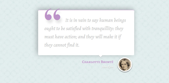
В третьем примере, мы хотим, увеличить оболочку и установить тень цитате:
Code
.mb-style-3 {
width: 500px;
}
.mb-style-3 blockquote{
background: #fff;
padding: 30px;
border-radius: 5px;
box-shadow:
inset 0 2px 0 rgba(188, 147, 200, 0.7),
-5px -4px 25px rgba(0, 0, 0, 0.3);
}
Мы добавим небольшую стрелку указывающую вниз, используя технику, предлагаемых в CSS Arrow Please!:
Code
.mb-style-3 blockquote:after,
.mb-style-3 blockquote:before {
top: 100%;
border: solid transparent;
content: " ";
height: 0;
width: 0;
position: absolute;
pointer-events: none;
}
.mb-style-3 blockquote:after {
border-top-color: #ffffff;
border-width: 10px;
left: 65%;
margin-left: -10px;
}
.mb-style-3 blockquote:before {
border-top-color: rgba(0,0,0,0.01);
border-width: 11px;
left: 65%;
margin-left: -11px;
}
Абзац будет иметь данный стиль:
Code
.mb-style-3 blockquote p {
font-family: 'Alegreya', serif;
font-size: 24px;
color: #b4b4b4;
font-weight: 400;
line-height: 40px;
font-style: italic;
text-indent: 100px;
position: relative;
}
Теперь мы добавим влево кавычки, с помощью псевдо-элемента :before :
Code
.mb-style-3 blockquote p:before{
content: '\201C';
font-family: serif;
font-style: normal;
font-weight: 700;
position: absolute;
font-size: 175px;
top: 0px;
left: -105px;
color: rgba(188, 147, 200, 1);
text-shadow: 7px 14px 10px rgba(0, 0, 0, 0.1);
}
Стилизация части со ссылкой и автором:
Code
.mb-style-3 .mb-attribution {
text-align: right;
padding: 20px 100px 20px 20px;
position: relative;
}
Эскизом разделения будет маленький кружок с изображением автора в качестве фона:
Code
.mb-style-3 .mb-thumb {
display: block;
width: 70px;
height: 70px;
border: 5px solid #fff;
border-radius: 50%;
background: url(../images/bronte.jpg) no-repeat center center;
position: absolute;
right: 10px;
bottom: 5px;
box-shadow:
inset 1px 1px 4px rgba(0,0,0,0.5),
0 2px 3px rgba(0,0,0,0.6);
}
И стили текста выглядят так:
Code
.mb-style-3 .mb-author{
font-family: 'Alegreya SC', serif;
font-weight: 700;
font-size: 18px;
color: rgba(188, 147, 200, 1);
text-shadow: 0 1px 1px rgba(255,255,255,0.7);
}
.mb-style-3 cite a{
font-family: 'Alegreya', serif;
font-weight: 700;
font-style: italic;
color: #fff;
text-shadow: 0 1px 1px rgba(0,0,0,0.3);
}
.mb-style-3 cite a:hover{
color: rgba(188, 147, 200, 1);
text-shadow: 0 1px 1px rgba(255,255,255,0.7);
}
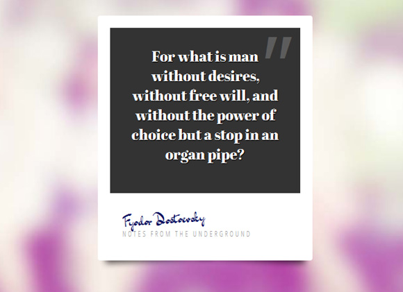
Пример 4
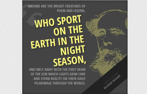
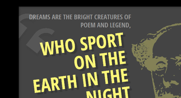
Этот пример немного смелее. Мы создадим темно большую коробку с большим размером цитаты. Ко всему этому, образ автора будет установлен в качестве фона:
Code
.mb-style-4 {
width: 600px;
padding: 20px 240px 50px 20px;
background: #444 url(../images/dickens.jpg) no-repeat 140% 25%;
overflow: hidden;
box-shadow: inset 0 0 10px rgba(0,0,0,0.6);
}
Абзац цитаты будет иметь значение RGBA , что позволяет определить значение не прозрачности:
Code
.mb-style-4 blockquote p {
color: rgba(255,255,255,0.95);
font-size: 21px;
line-height: 26px;
text-align: right;
color: #999;
text-transform: uppercase;
font-weight: bold;
}
Пролет будет иметь особый стиль. МЫ немного повернем его и придадим ему больший размер текста и разные цвета:
Code
.mb-style-4 blockquote p span {
font-weight: 700;
color: #fcf779;
font-size: 58px;
line-height: 58px;
display: block;
padding: 10px;
text-shadow: 7px 7px 2px rgba(0,0,0,0.2);
transform: rotate(-7deg) translateY(10px);
}
Давайте добавим кавычки с помощью псевдо - класса :before :
Code
.mb-style-4 blockquote p span:before {
font-family: 'icons';
content: '\275d';
font-weight: normal;
opacity: 0.1;
font-size: 136px;
position: absolute;
color: #fff;
top: -50px;
left: -25px;
transform: rotate(45deg);
}
Не прозрачность будет очень низкой и мы повернем его на 45 градусов.
Присвоение разделения будет поворачиваться таким образом, что мы сможем видеть только треугольник в правом верхнем углу:
Code
.mb-style-4 .mb-attribution {
text-align: right;
text-transform: uppercase;
font-weight: bold;
background: #222;
position: absolute;
width: 100%;
left: 0px;
bottom: 0px;
text-align: center;
padding: 30px;
transform: rotate(-40deg) translate(175px, 110px);
}
Давайте добавим тире автору элемента:
Code
.mb-style-4 .mb-author:before {
content: '\2014';
padding-right: 4px;
}
.mb-style-4 .mb-attribution cite a{
color: #777;
}
.mb-style-4 .mb-attribution cite a:hover{
color: #fcf779;
}
Пример 5
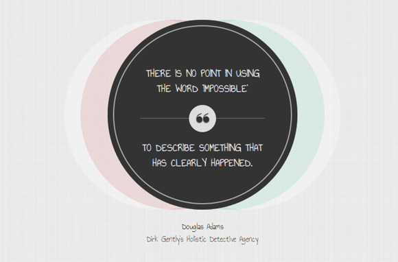
Пятый пример будет выглядеть как набор окружностей. Мы будем использовать несколько теней поля для достижения нашего результата:
Code
.mb-style-5 {
width: 390px;
}
.mb-style-5 blockquote {
text-align: center;
background: #333;
width: 350px;
height: 350px;
padding: 60px;
border-radius: 50%;
box-shadow:
inset 0 0 0 10px #333,
inset 0 0 0 12px rgba(255,255,255,0.6),
80px 0 0 rgba(255,255,255,0.3),
-80px 0 0 rgba(255,255,255,0.3),
50px 0 0 rgba(60,185,145,0.2),
-50px 0 0 rgba(185,60,60,0.2);
}
Стиль абзаца:
Code
.mb-style-5 blockquote p {
color: #fff;
font-size: 20px;
font-weight: 400;
padding-top: 25px;
text-transform: uppercase;
text-shadow: 0 0 1px #fff, 0 1px 1px #000;
font-family: 'Annie Use Your Telescope', cursive;
}
Для того,чтобы отделить цитату, мы поставим последнюю часть ее в службы и установим в верхнем поле + отступы:
Code
.mb-style-5 blockquote p span {
display: block;
position: relative;
padding-top: 40px;
margin-top: 40px;
border-top: 1px solid rgba(255,255,255,0.3);
}
Добавим небольшой круг с кавычками:
Code
.mb-style-5 blockquote p span:before {
position: absolute;
width: 50px;
height: 50px;
background: #ddd;
content: "\275d";
font-size: 40px;
color: #333;
top: 0px;
left: 50%;
margin: -25px 0 0 -25px;
border-radius: 50%;
}
И, наконец, другие стили для некоторых элементов теста:
Code
.mb-style-5 .mb-attribution {
text-align: center;
font-family: 'Annie Use Your Telescope', cursive;
padding: 20px;
font-size: 16px;
}
.mb-style-5 cite a:hover{
color: #000;
}
Пример 6
Последний пример будет выглядеть Polaroid, кроме того, мы будем использовать изображения:
Стиль оболочки:
Code
.mb-style-6 {
width: 350px;
height: 400px;
background: #fff;
border-radius: 4px;
}
Давайте добавим хорошие тени, используя технику Nicolas Gallagher:
Code
/* Shadow style from Nicolas Gallagher: http://nicolasgallagher.com/css-drop-shadows-without-images/demo/ */
.mb-style-6:before,
.mb-style-6:after {
content: "";
position: absolute;
z-index: -2;
transform: rotate(-3deg);
bottom: 15px;
box-shadow: 0 15px 10px rgba(0, 0, 0, 0.7);
height: 20%;
left: 10px;
max-height: 100px;
max-width: 300px;
width: 50%;
}
.mb-style-6:after {
transform: rotate(3deg);
left: auto;
right: 10px;
}
Фон цитаты будет темным:
Code
.mb-style-6 blockquote{
background: #333;
height: 75%;
padding: 30px;
text-align: center;
}
Добавляем кавычки с правой стороны:
Code
.mb-style-6 blockquote:before{
color: rgba(255,255,255,0.2);
position: absolute;
content: '\0022';
font-size: 150px;
line-height: 130px;
font-style: italic;
top: 0px;
right: 20px;
font-family: Cambria, Georgia, serif;
}
Добавим дополнение к присвоению деления:
Code
.mb-style-6 .mb-attribution {
padding: 20px;
}
Элемент автор будет немного поворачиваться, и мы будем использовать рукописный шрифт, чтобы сделать его похожим на подпись:
Code
.mb-style-6 .mb-author {
font-size: 24px;
font-family: 'Dr Sugiyama', cursive;
-moz-transform: rotate(-4deg);
color: #070d5f;
}
И последнее , но не менее важное, ссылки:
Code
.mb-style-6 cite a{
color: #999;
text-transform: uppercase;
letter-spacing: 3px;
font-size: 12px;
}
.mb-style-6 cite a:hover{
color: #000;
}
Надеюсь, вам понравилось и вы нашли свое вдохновение!
